Please select an article from the left menu to display its content.
1. Introduction to UI Builder
The UI Builder in Studio allows you to design dynamic, data-driven forms with ease. Whether you need simple input fields or complex automated calculations, the Form Builder provides intuitive tools to create and customize forms for your business workflows.
Key Benefits
- Drag-and-Drop Interface – Easily add and arrange fields.
- Data Integration – Connect forms to databases and master datasets.
- Automation – Use formulas to auto-calculate values.
- Custom Validation – Set mandatory fields and filters.
2. Navigation Guide for Form Builder
A. Accessing the Form Builder
-
Go to Studio > Your App / New App > Form
-
Click + Form or select an existing form to edit.
-
On the Design tab, click Edit Form to open the field builder.
B. Form Builder Layout
The Form Builder consists of three main sections:
-
Form Elements Panel (Left Sidebar)
-
Contains all available field types, grouped into Basic Elements and Advanced Elements.
-
Click a field to add it to the form canvas instantly.
-
-
Form Canvas (Center)
-
Displays the live preview of your form.
-
Click any field to configure its properties.
-
-
Field Properties Panel (Right Sidebar)
-
Configure field settings (label, placeholder, validation).
-
Set advanced options like Master Data, Data Model, and Formulas.
-
3. Adding and Configuring Fields
A. Basic Field Types
The Form Elements panel offers the following basic field types:
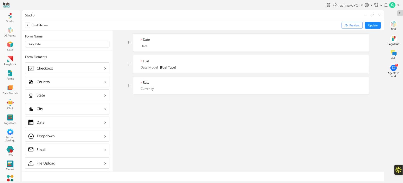
| Field Type | Description | Example Use Case |
|---|---|---|
| Text Field | Single-line text input | Asset Name, Employee ID |
| Number | Numeric-only input | Quantity, Age |
| Phone | Formatted phone number input | Contact Number |
| Email address input with format validation | Contact Email | |
| Dropdown | Predefined list of options, single selection | Department, Status |
| MultiSelect | Predefined list of options with multiple selections allowed | Skills, Tags |
| Radio Button | Single choice from a small set of visible options | Approval Status |
| Checkbox | Toggle for binary choices | Active/Inactive |
| Date | Date picker | Purchase Date |
| Time | Time picker | Appointment Time |
| Paragraph | Multi-line text input for longer free-text entries | Notes, Description |
| Country | Country selector | Shipping Country |
| State | State/province selector | Shipping State |
| City | City selector | Shipping City |
| Geo Coordinates | Captures a location's latitude/longitude | Site Location, Delivery Point |
| File Upload | Attach documents | Invoice Upload |
Good to know: For Country, State, and City fields, the list of options is managed automatically by LogixFlow — there's no need to enter or maintain option lists yourself, unlike Dropdown, MultiSelect, or Radio Button fields.
Steps to Add a Basic Field:
-
Click a field type (e.g., Text Field) in the Form Elements panel to add it to the canvas.
-
In the field's configuration block, set:
-
Label Name (e.g., "Asset Name")
-
Add to Filter, Hidden, Mark Mandatory, and Unique Entry as needed
-
-
To remove a field, click its trash icon and confirm the deletion.
Text Field Options:
The Text Field has a few extra options not shared by other basic fields:
-
Type - Switch between Text (plain input) and Password (masks what's typed).
-
Auto Generate - Automatically fills the field with a system-generated number instead of manual entry. Turning it on reveals a Prefix (Optional) and a Start Number, with a live Preview of the generated value (e.g., prefix "INV-" with start number 100 previews as "INV-100").
-
Unique Entry - Prevents duplicate values from being submitted for this field.
-
Enable Scan - Adds a barcode/QR scan option for this field in the LogixHub mobile app, so users can scan a code instead of typing.
B. Advanced Field Types
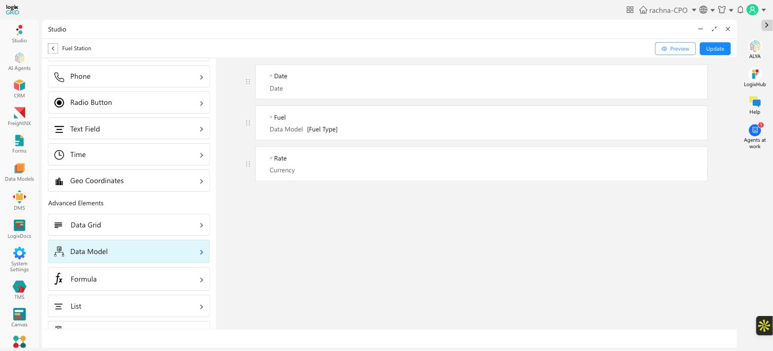
1. Master Data Fields
Link fields to the Master Data available in LogixFlow — the same datasets managed under System Settings > Masters (Customer, Vendor, Airline, Driver, Vehicle, Package Type, and more) — for standardized selections.
Configuration Steps:
-
Drag a Dropdown field onto the form.
-
In Properties, select Master Data > Choose a dataset (e.g., "Customer").
-
Enable Add to Filter for searchable dropdowns.
-
Toggle Mandatory Field if required.
2. Data Model Fields
Pull dynamic data from existing database tables.
Configuration Steps:
-
Drag a Dropdown or Multiselect field.
-
In Properties, select Data Model > Choose a table (e.g., "Asset Tracking").
-
Set Key Column (unique identifier, e.g., "Asset_ID").
-
Enable Add to Filter for search functionality.
Scoping which records appear (Apply Criteria):
If the field should only populate with a subset of records — for example, only Products from a specific Category — enable Apply Criteria in the field's configuration. This reveals a condition builder:
-
Build a condition from If Field, Select Operator, and Select Value (e.g., "Category equals Electronics").
-
Chain additional conditions with And / Or.
Good to know: Only records matching the criteria are shown as options — this is different from Add to Filter, which just makes the field itself searchable/filterable, without restricting which records appear.
3. Formula Fields
Automatically calculate values using math functions.
Configuration Steps:
-
Click Add Field > Formula.
-
Enter Field Name (e.g., "Total Asset Value").
-
Write the formula (e.g.,
MULTIPLY(Asset Count, Asset Price)). -
Select Trigger:
-
On Create (calculates when record is created).
-
On Update (recalculates when edited).
-
Supported Functions:
-
ADD()– Sum values. -
MINUS()– Subtract values. -
DIVIDE()– Perform division. -
MULTIPLY()– Calculate products.
4. Data Grid
Adds a repeatable grid of sub-fields to your form, useful for capturing multiple rows of related data under a single field — for example, a list of line items on an order.
5. List
Adds a repeatable list built from a single field type, useful for capturing multiple values under one label — for example, several contact numbers for the same record.
4. Form Rules & Validation
A. Mandatory Fields
-
Toggle Mandatory Field in the Properties Panel.
-
Users must fill these fields before submitting.
B. Conditional Logic
-
Show/hide fields based on user input (e.g., display "Approver" field only if "Amount > $1000").
-
For advanced conditional logic — including multiple chained conditions and rules triggered by a button click — see the Rule Engine article.
5. Publishing the Form
-
Click Save to store changes.
-
Publish to make the form live for users.
-
Share via link or embed in a portal.
Points to Note
-
Auto-Created Data Model
-
Every form you create automatically generates a corresponding data model with the same name as the form title.
-
This data model stores all submissions and can be accessed for reporting, workflows, or integrations.
-
-
Form Title = Navigation Link
-
The Form Title you set will appear in the left navigation panel as a clickable link.
-
Users can directly access the form from here.
-
-
Customizing Form Layout
-
Use LogixFlow Flexi UI Designer to modify the form’s appearance, including:
-
Field arrangement (single/multi-column layouts).
-
Styling (colors, fonts, spacing).
-
-